A Fresh Look for Prague Metro’s ‘Dachshunds’: Improved Design for Easier Commuting
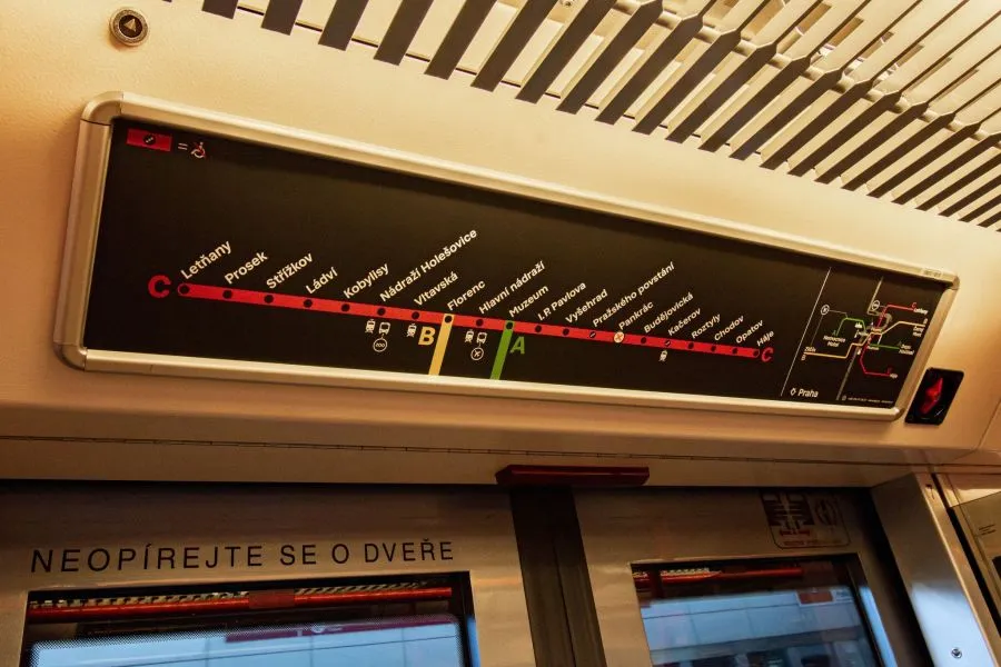
Above the doors of metro carriages, the entire metro network and a detailed depiction of the respective line are now displayed alternately
The Prague Metro’s “dachshunds”—the schematic line maps cherished by both residents and visitors—have received a modern update. As part of the “Čitelná Praha” (Readable Prague) project, these graphics have been redesigned to enhance navigation and readability for passengers.
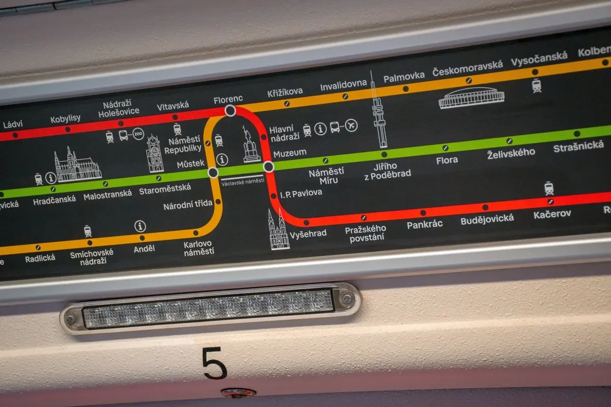
The iconic metro maps, affectionately known as “dachshunds” (jezevčíci) in Prague, now feature a fresh design. Prague Public Transport has begun installing the updated graphics in all metro trains. Above the doors, passengers can view alternating displays of the full metro network and a detailed map of the specific line.
The redesign was developed by Studio Side2 as part of the “Čitelná Praha” project. In early 2024, the initial design underwent a detailed user analysis.
“The iconic ‘dachshunds’ of the Prague Metro are getting a fresh look! I want to thank all passengers who participated in the tests and provided valuable feedback. This input was crucial! Thanks to it, we increased the font size, improved the accessibility symbol, and highlighted transfer stations more clearly. Together, we’re creating a Prague where everyone can easily find their way,” said Zdeněk Hřib, Deputy Mayor of Prague and City Councillor for Transport.
Extensive surveys conducted directly in the Prague Metro assessed the readability and clarity of individual elements. Analysts examined what passengers found missing or unnecessary in the graphics, evaluated the functional differences compared to the previous design, and determined which map variant above the doors was preferred. Based on these findings, Studio Side2 finalized the network graphic, closely adhering to public suggestions and practical requirements.

What Has Changed Compared to the Tested Design?
- Enlarged font and uniform alignment of station names in the three-line variant.
- A new, clearer symbol for station accessibility.
- Adjusted symbols for connections to buses heading to the airport or zoo.
- More prominently marked transfer stations in the city center.
- Line designations using letters moved to the end of each line.
- Additional landmarks included in the three-line variant (e.g., Old Town Hall, Vyšehrad, Prague Arena).
The new “dachshund” maps are now being installed in all metro carriages. Insights and adjustments from this process will also inform other elements of the Čitelná Praha project, including metro station signage and additional transport maps and schemes.
More from Featured


Political Restart in the Czech Republic: New Government Adopts Policy Agenda

