Strong, Timeless, and Recognisable: Prague’s New-Look Logo
Instead of creating a completely new visual identity, the Czech capital has opted to revise the logo it introduced more than twenty years ago
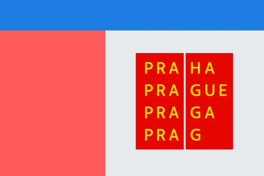
Prague presents itself in new splendour: the visual identity of the Czech capital has been revised and modernised. Based on an analysis by Czechdesign and in collaboration with Studio Najbrt, the iconic logo has been given a facelift while retaining its timeless character.
One of the oldest and best-known brands in the Czech Republic has undergone a comprehensive overhaul. Following an expert analysis of the current state, prepared by Czechdesign, Prague City Hall has slightly modified its visual identity in collaboration with the original designer, Studio Najbrt. The strength and qualities of the timeless logo have been retained, but the rules for the placement of text, logos, and fonts, as well as the structure of the logo usage system for organisations established by the city, have been adapted. Additionally, guidelines for digital usage have been included in the graphic manual for the first time.
The current visual identity of the City of Prague, which boasts more than 20 years of tradition, is one of the longest-existing in the Czech Republic. The ‘Prague’ brand is considered timeless, strongly anchored, and easily recognisable. However, a comprehensive visual identity system that fully reflects the strength of the logo in the wide range of applications the city uses to communicate with citizens and visitors has been lacking.
Pictograms are also part of the standardised visual style. A basic set was developed to visually match the main ‘Prague’ font. To expand this set as needed, the authors have defined a process for creating additional characters that fit seamlessly into the standardised morphology.
The colour scheme of the visual style has been significantly expanded. In addition to the palette of basic colours, colour combinations have been defined that can be used flexibly depending on the context. The colour palette is also reflected in the illustrations, which can be recoloured if necessary to maximise their reusability without risking monotony.
Along with the overhaul of the overall visual identity, the logo also underwent a subtle facelift. The letters were redrawn and visual corrections were made. Thanks to these careful changes, it is not necessary to immediately replace all applications of the original logo. The simultaneous appearance of old and new versions in the public space is unproblematic, allowing the changes to be implemented gradually.


